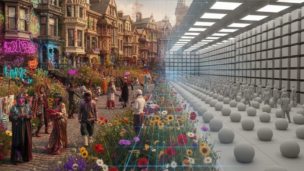
We are running a five-day immersive AI bootcamp in a couple of weeks, and as I was tinkering with tools and activities I was struck by a phenomena Forbes and others have called "The Great Averaging". This is this idea that as we use genAI more and more, content converges to an average of whatever the major providers have decided it should be.
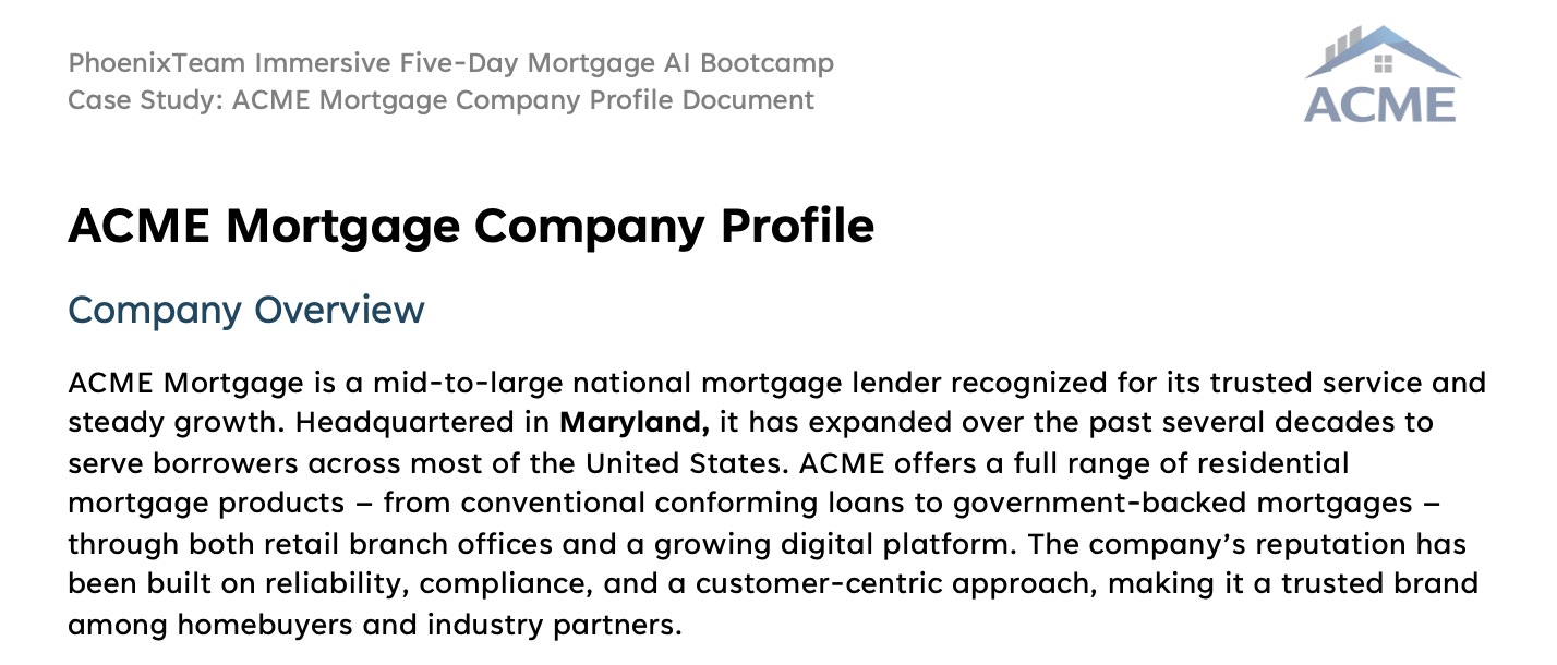
In our bootcamp, we use a case study company - ACME Mortgage, which is a midsized national lender that originates and services. (It is not lost on me that I have effectively already homogenized with the generic, watered down company but I digress). We use this case study company throughout the class to aid students on their journey. We pull different threads about the company into the activities, which are both online and offline.
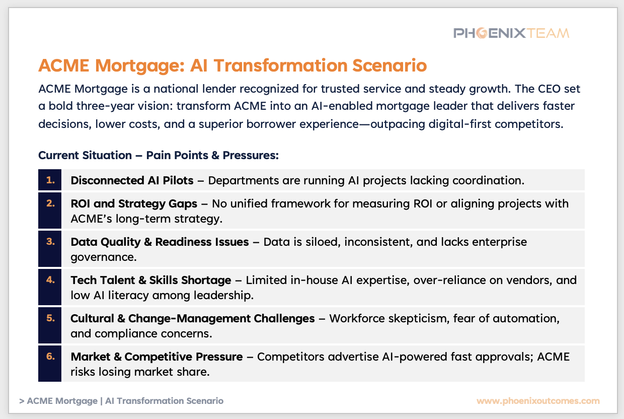
ACME Mortgage's CEO, the completely fictitious Farrah Chen has given her executive team a bold three year goal - transform ACME into an AI-enabled mortgage leader that delivers faster decisions, lower costs, and a superior borrower experience—outpacing digital-first competitors. Our fictitious company has all the usual pain points we are seeing in mortgage, disconnected pilots, talent gaps. And these gaps set out a journey for the class to overcome together working in small teams to solve the problems.
One of the skills we build in bootcamp is vibe coding. Yes, yes, there are plenty of vibe coding haters out there but I am a vibe coding superfan and I find it to be remarkably useful and accelerative. In terms of discovering and visualizing, it has been a massive game changer. We take the company profile and the ACME Mortgage logo and we build a company website, first in Replit and then in Anthropic Claude Code. It's absolutely remarkable how similar these sites came out. Same profile, two different ways of creating the website, two different large language models on the backend, largely homogenized results.
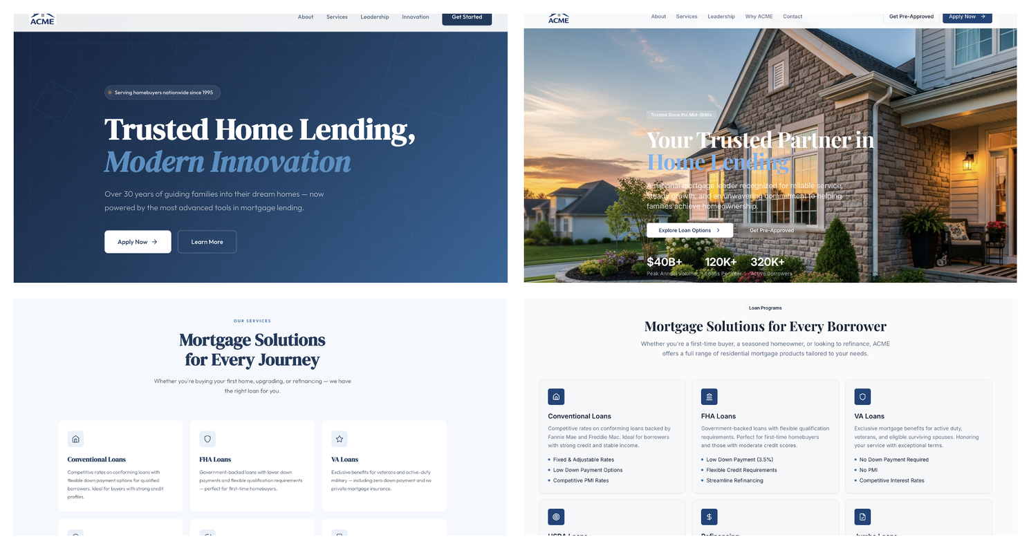
I started with Replit and was wondering how it would come out in Claude Code. I was both not disappointed and disappointed at the same time.
There are many good and explainable reasons why they came out so similar, let's face it - company websites do have a tendency to look the same, and both the models on the back end were undoubtedly trained on similar data. It all makes sense. But gosh, it's both remarkable and remarkably boring what has happened here.
Truly remarkable that in less than 20 minutes I can spin up a perfectly respectable website, and remarkably boring how uninteresting the result it. I've seen this with other things I've built, workflow looks the same, navigation looks the same, colors are the same. I can, of course, inject my own creativity and flair into what I build (and I do) but left to the default - they are all the same.
Once again, this reminds me that human creativity still remains uniquely human. It reminds me that digital is becoming cheaper and cheaper with each passing day. I've taken it now as a personal mission to move away from cheap digital slop and into quality, curated "offline" content and experiences. I love the look and feel of a nice business card (I know, I know). I love the way a nice paper feels between my fingers, or the way a high quality pen writes (Uniball Vision Elite fine point all the way).
I find the return to "old school" to be refreshing and personally satisfying, especially as we move at the breakneck page of AI change.
By Tela Mathias, CTO & Chief Nerd and Mad Scientist